
This week we practiced going through protocols in CLC. I found this process to be relatively easy but did not understand what I was doing. It was easy enough to go through the steps to complete the practice this week but I did not understand much of what the program was analyzing and creating graphs of. What I found most challenging was understanding what was happening during the “demultiplexing 16S/ITS regions” steps. I had no idea what was happening during this section and had a hard time interpreting the results. This assignment took me a couple of hours.
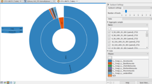
This is the very last graph I made, The UNITE OTU graph. I couldn’t figure out how to make the image not blurry, so bear with me, please. This graph is describing the fungal makeup of the samples given. 96% of the results were a member of the fungi family as associated with the inner ring. The outer ring demonstrates the species makeup of all the fungi represented in these samples. 96% of all the fungi were the species Ascomycota. by clicking on that section another graph will pop up that will describe the specific makeup of the Ascomycota seen in these samples. I thought these graphs were a very cool way to organize the data in a representative and organized manner.
Overall my questions from last week remain the same. They are as follows:
-
- How did the microorganisms found in the control samples compare to the fruit samples for each person?
- Did the number of bacteria versus fungi and yeast affect the rising rate of each sample?
- How did the location the fruit came from, affect the microbe composition between all of the sequenced fruit samples?